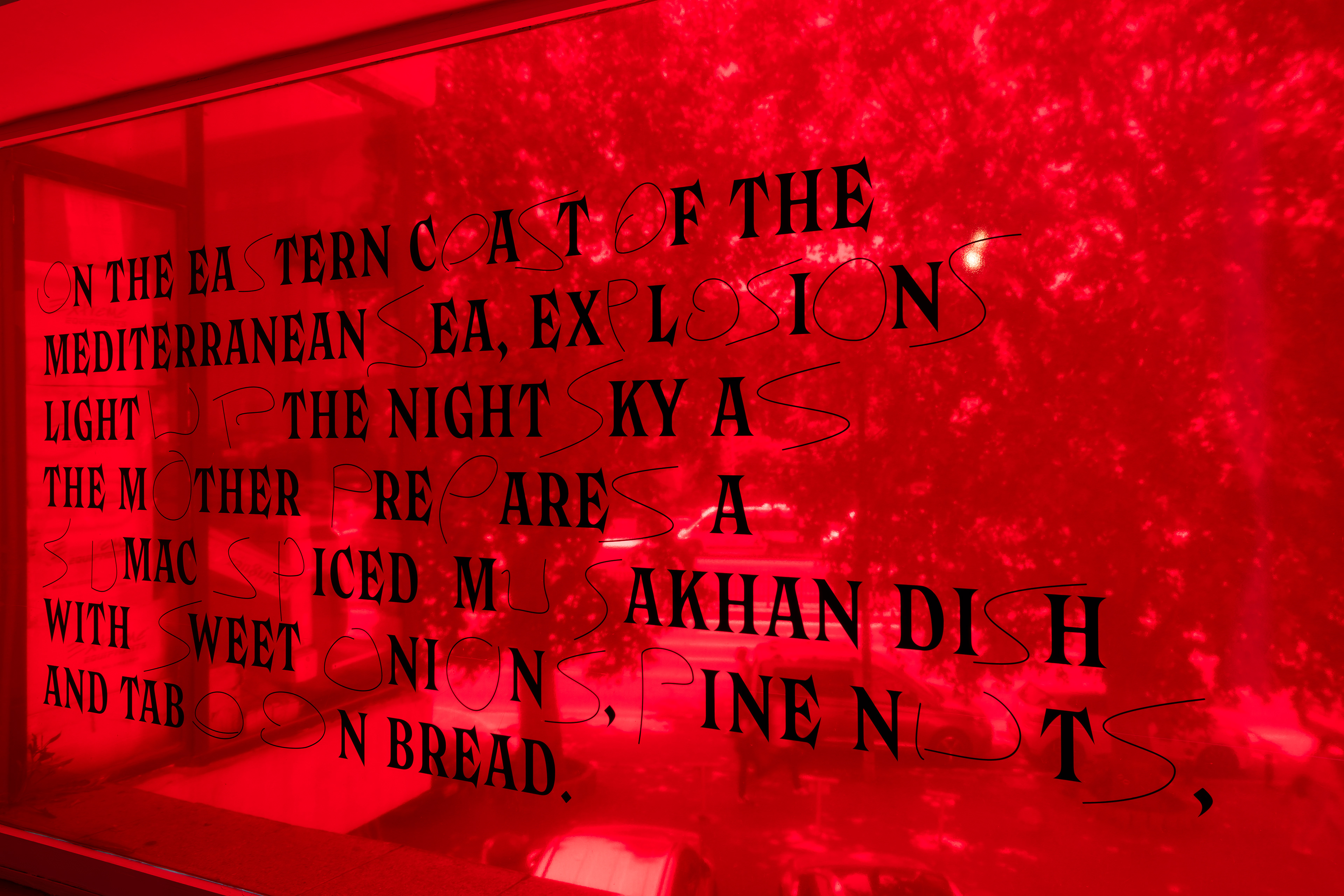
The first passage of the Konvolut section, “Musakhan,” written by İrem Günaydın in the bespoke typeface “Hamaset.”
Concept Overview
OPUS: A Para-Opera is a long-term, research-driven platform unfolding through text, publication, and typography. Functioning as a ‘living scaffold,’ it supports evolving relationships and expands artistic access to restricted or contested spaces. It explores the intersections of support, structure, justice, protest, resistance, truth, and event, aiming to blur and rupture the lines between them. Rooted in the idea of “para”—meaning beside, beyond, or against—it uses para-fiction to question the relationship between truth, media, and politics in the post-truth era. If opera traditionally combines music, text, and spectacle to create an immersive experience, para-opera extends this beyond the stage, operating through acts of inscription, rewriting, and typographic performance. Named after the Latin word for "work" (with “opera” as its plural), OPUS unfolds in fragments. The current one, Konvolut, is inspired by Walter Benjamin’s The Arcades Project, a collection of passages. Konvolut is a German word that means a bundle of papers, and as a fragment, is dedicated to the Occupied Palestinian Territories.
Konvolut includes passages assigned to collaborators for handwritten rewriting, incorporating the letters O, P, U, and S into each version. Each passage is not merely a static text but a score for the performative inscription, a script that invites re-interpretation and collective authorship. This process mirrors opera’s layered dramaturgy, where meaning is constructed through recurrence, variation, and interplay between different voices. Just as an opera unfolds through arias, leitmotifs, and acts, OPUS develops through textual passages that morph across iterations, gaining new resonances with each re-inscription.
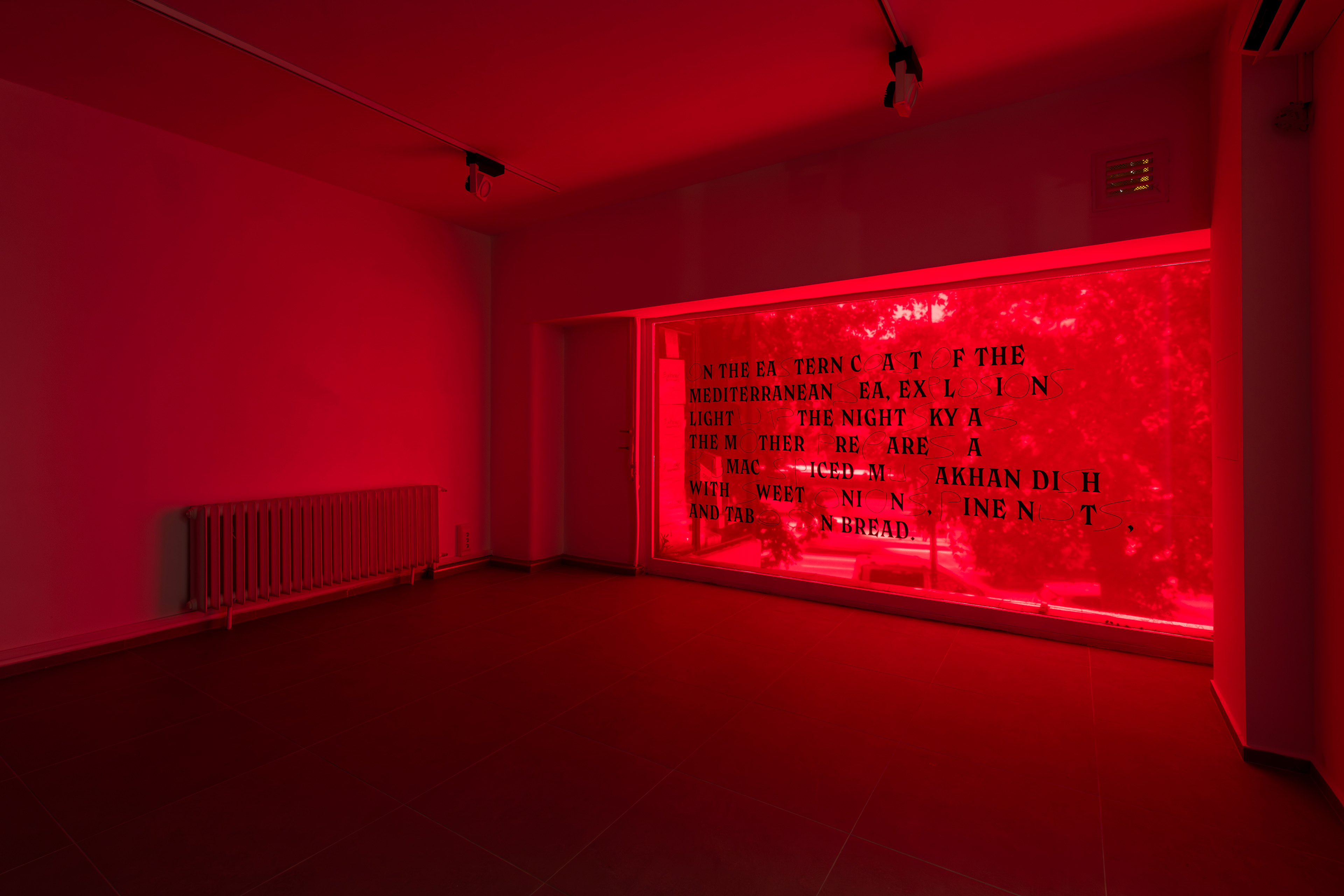
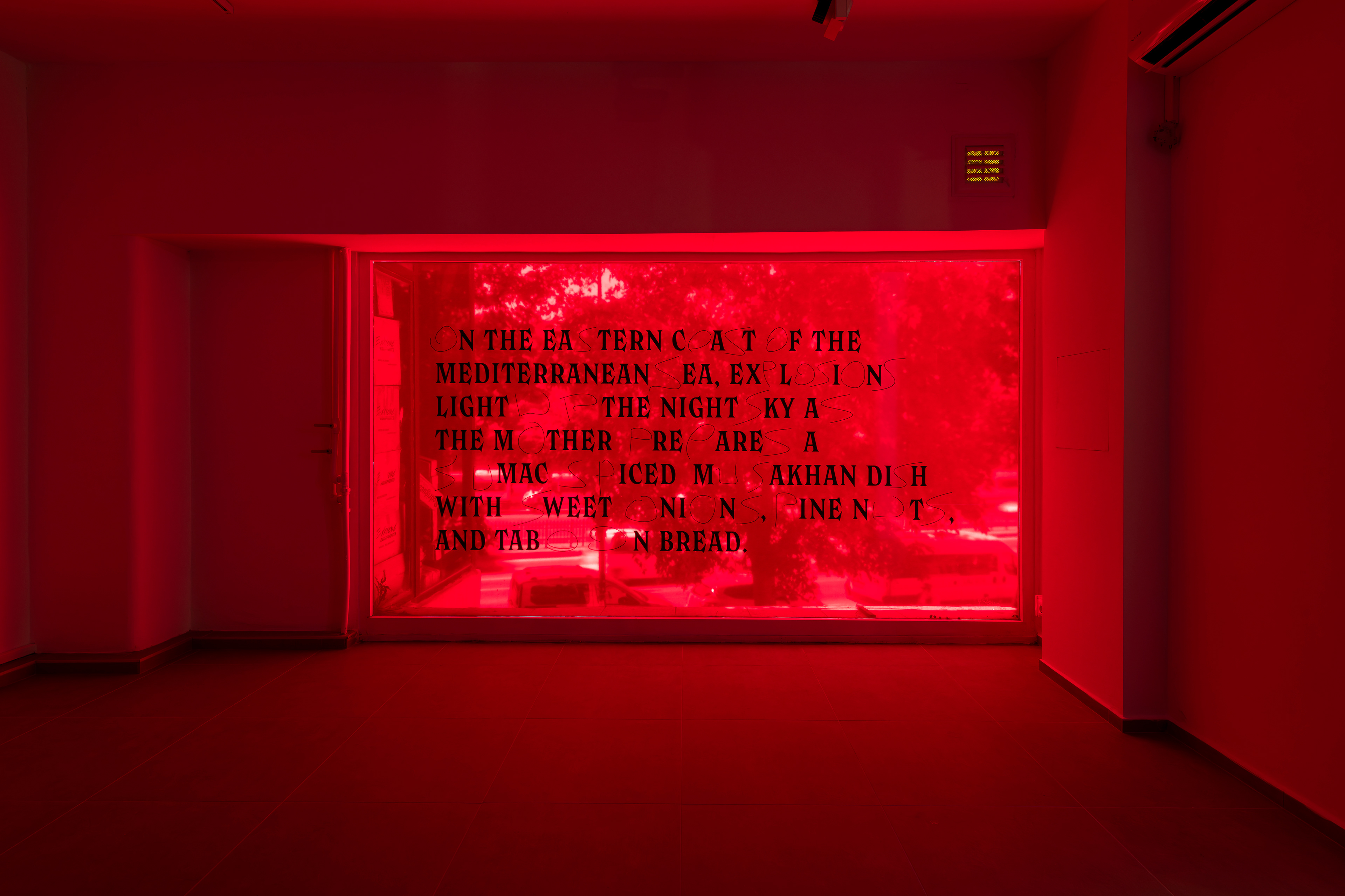
Vinyl letters on transparent colored vinyl, 184x334 cm.
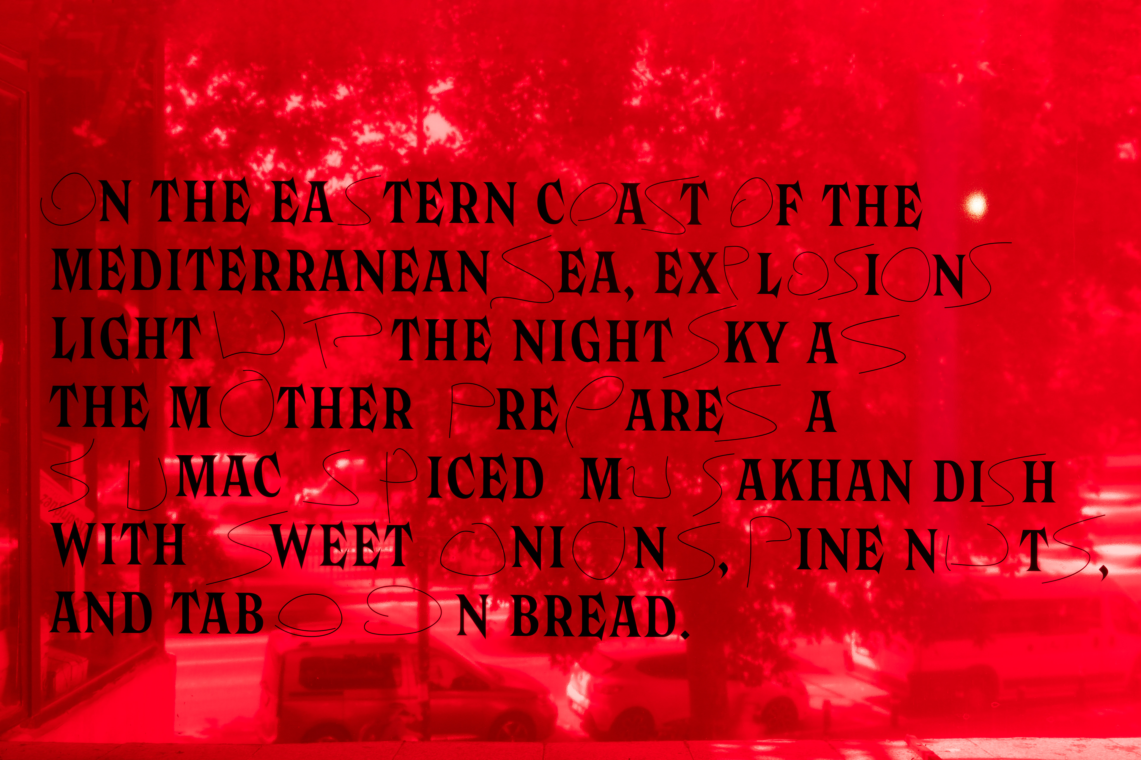
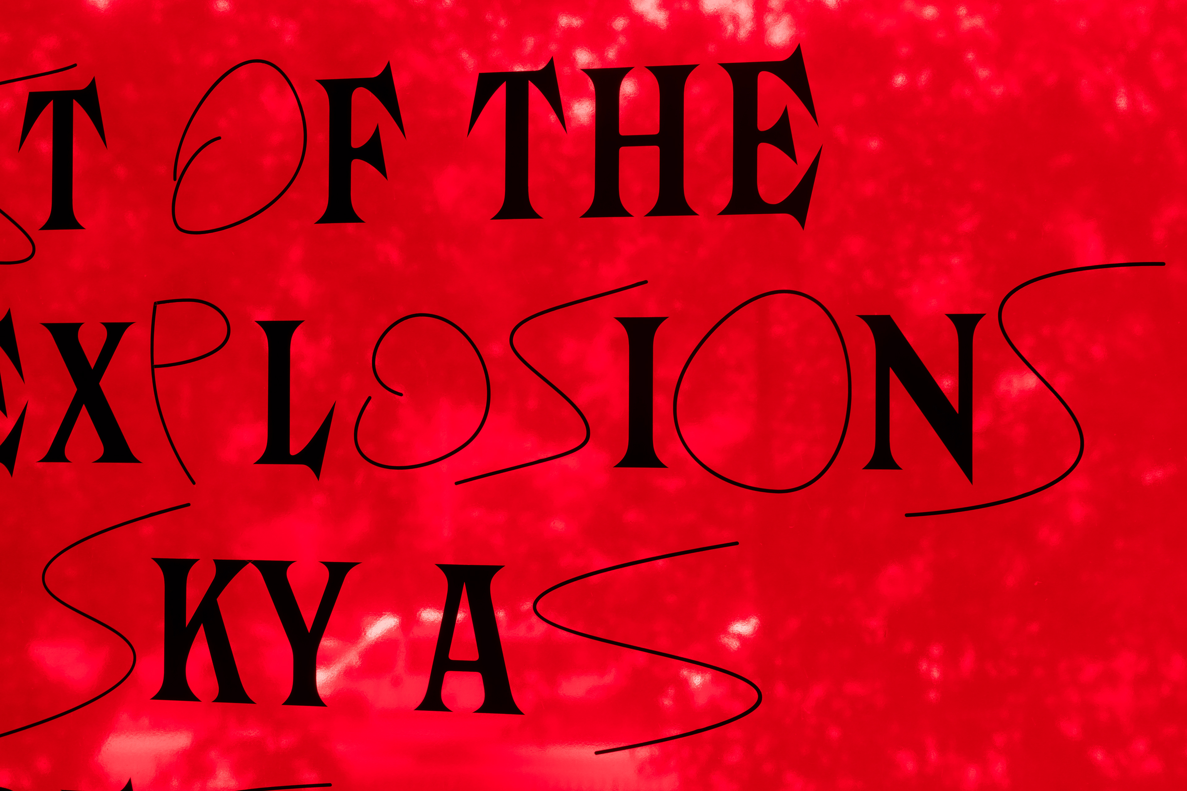
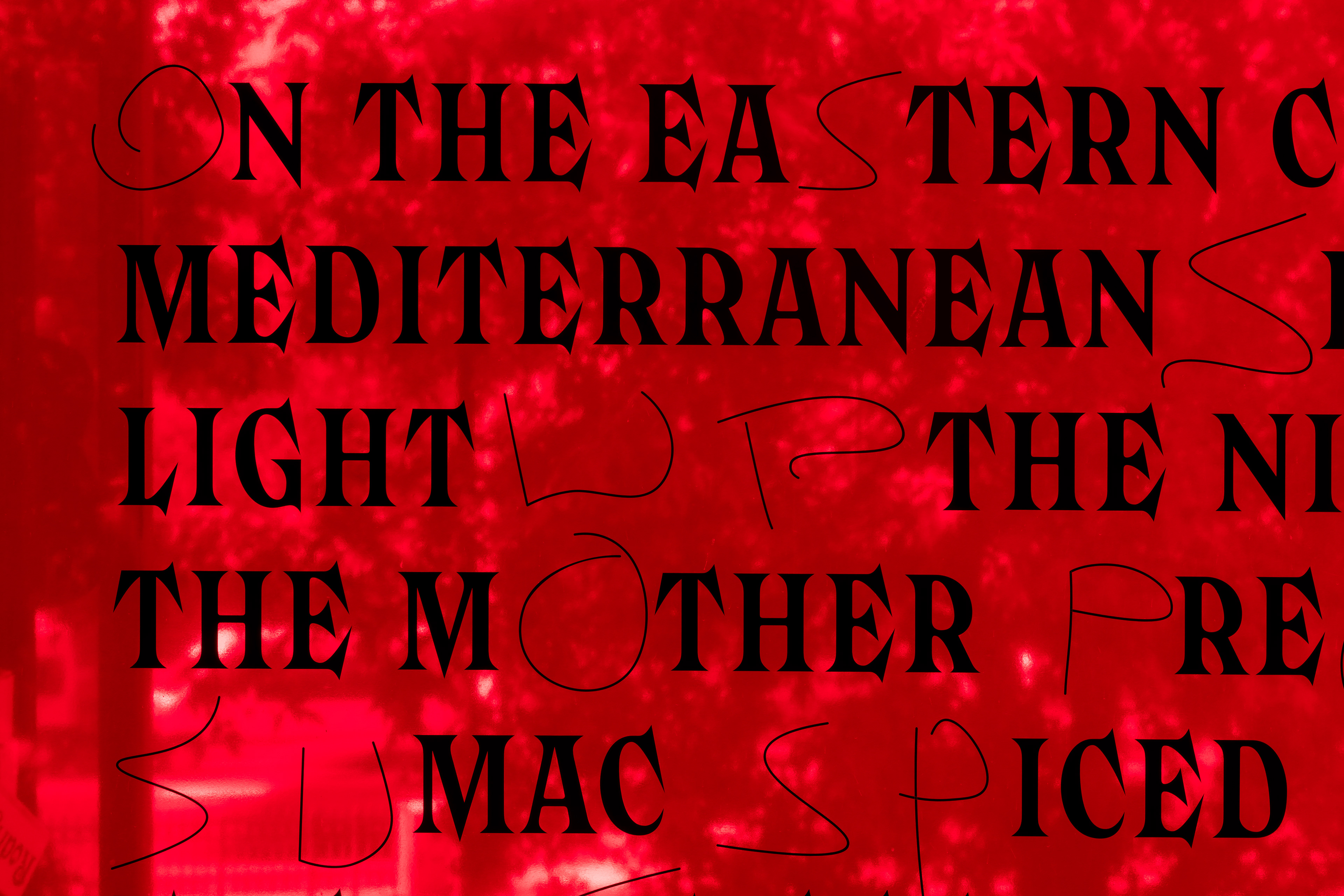
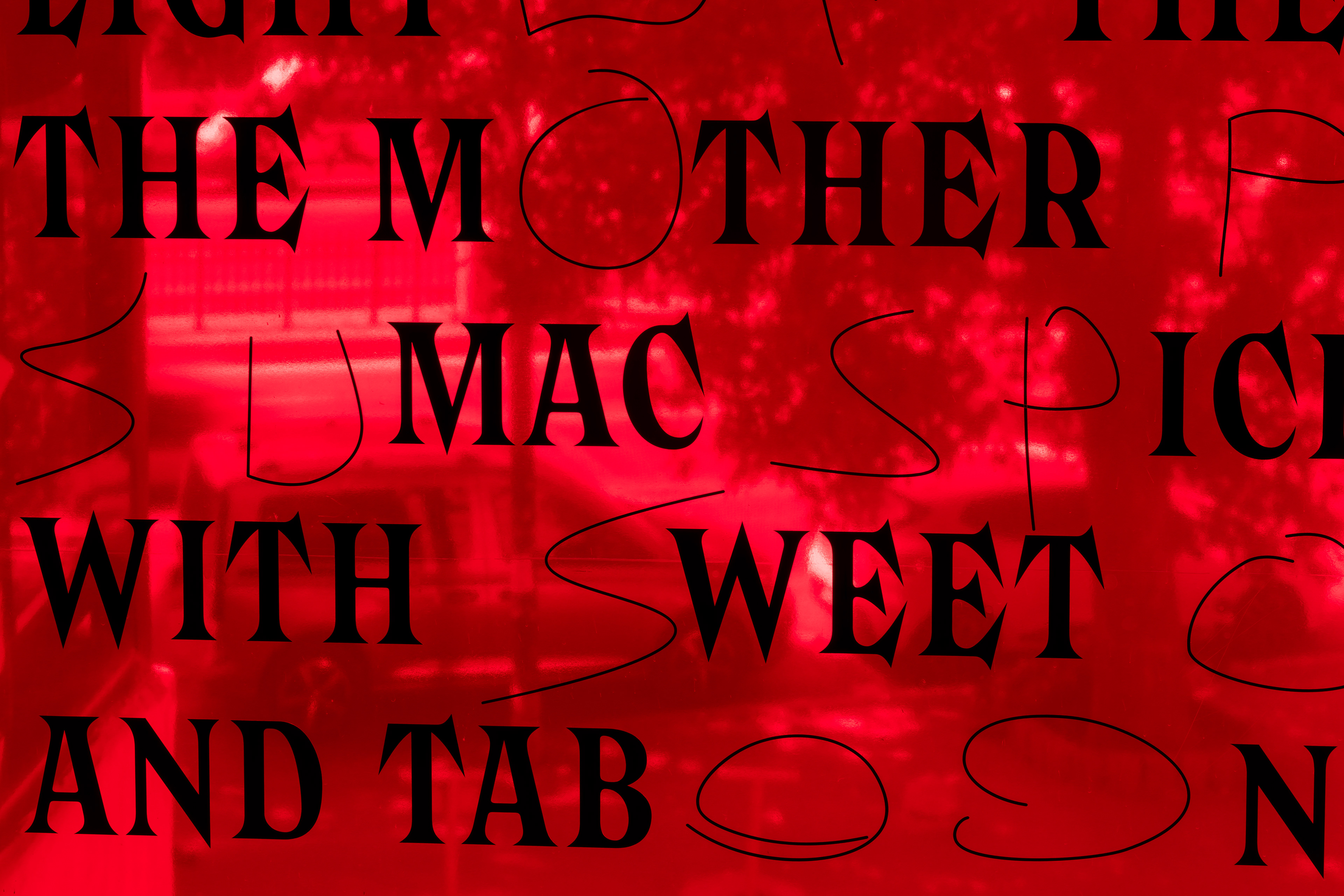
"ON THE EASTERN COAST OF THE MEDITERRANEAN SEA, EXPLOSIONS LIGHT UP THE NIGHT SKY AS THE MOTHER PREPARES A SUMAC-SPICED MUSAKHAN DISH WITH SWEET ONIONS, PINE NUTS, AND TABOON BREAD."
The letters of “OPUS,” handwritten by Irem Günaydın, are embedded into the passage.
Details from the MUSAKHAN
Details from the MUSAKHAN
Typography as Political Discourse
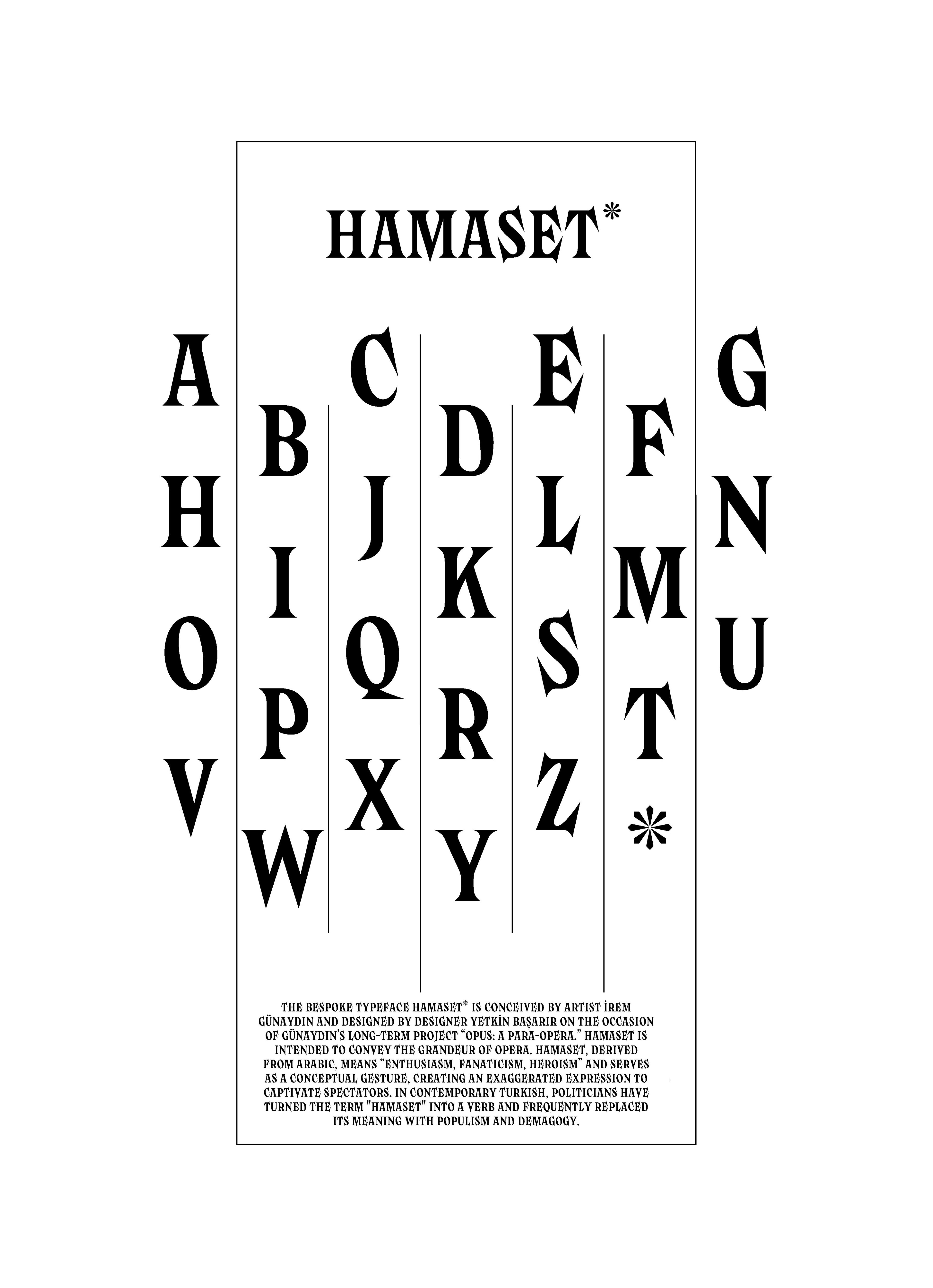
OPUS employs a bespoke typeface, HAMASET, developed in collaboration with a type designer on my invitation to visually echo the grandeur of opera while engaging in a critique of contemporary political rhetoric. Hamaset, derived from an Arabic loanword meaning enthusiasm, courage, and heroism, has been recontextualized in contemporary Turkish discourse by politicians to signify populism and demagogy. This typographic intervention in OPUS reflects how language, like history, is subject to shifts in meaning and power structures. HAMASET represents contested spaces where typography serves as a battleground for ideological transformations. HAMASET is monumental, sharp, and prickly on the outside but soft and round on the inside to create dialectical tension. Additionally, it has only uppercase letters.
Each passage, written in the HAMASET typeface, is entrusted to an invited collaborator, who inscribes it anew in their handwriting, embedding the letters O, P, U, and S within the text. This act of inscription becomes an exercise in co-authorship, resisting fixed narratives and embracing the fluidity of meaning.

The First Passage of Konvolut: MUSAKHAN
(Produced as part of my residency at Saha Studio in Istanbul, Turkiye, 2024.)
MUSAKHAN anchors OPUS’s exploration in a profoundly historical and political context. Musakhan is a national Palestinian dish with sumac-spiced chicken, sweet onions, pine nuts, and taboon bread. More than a culinary tradition, it is a cultural signifier of home, resilience, and historical continuity. Within OPUS, Musakhan is not just food but a text; its preparation and consumption are a performance embedded in layers of meaning.
The passage MUSAKHAN;
"ON THE EASTERN COAST OF THE MEDITERRANEAN SEA, EXPLOSIONS LIGHT UP THE NIGHT SKY AS THE MOTHER PREPARES A SUMAC-SPICED MUSAKHAN DISH WITH SWEET ONIONS, PINE NUTS, AND TABOON BREAD.
This passage collapses temporal and spatial boundaries, positioning the act of cooking within an environment of conflict. It underscores how everyday practices, such as preparing a meal, persist in the face of violence, turning the kitchen into a space of resistance and cultural preservation. Through this, MUSAKHAN embodies a historical palimpsest where personal and collective memories overlap, inscribed within the broader politics of displacement and belonging.
The Influence of Kraliçe and Institutional Critique on OPUS’s Integration into HAMASET Typeface
The inscription of the letters O, P, U, and S draws inspiration from SALT’s former identity system, Kraliçe, an experimental typographic approach by Timo Gessner that emphasized fluidity over fixed logos. Its recent discontinuation in favor of a static corporate identity signals, in my view, a shift away from the dynamic, queer, and transformative toward the rigid and conservative. This move raises questions about institutional openness to experimentation. Please view the attached document regarding SALT's identity, Kraliçe, which is located at the end of the dossier.
In response, OPUS expands Konvolut through new passages and collaborators, while evolving the HAMASET typeface into varied typographic styles. Each variation reflects a distinct register of political speech, ranging from bureaucratic formality to protest inscriptions, visually encoding power, resistance, and legibility.
Please view the document here regarding the specimen design for the HAMASET typeface.