HAMASET Specimen Designs
HAMASET is a custom-designed typeface that forms a central pillar of my artistic practice, embodying an intentional provocation against institutional neutrality and typographic authority. The word “Hamaset” itself, which translates from Turkish as bombastic rhetoric or exaggerated nationalist speech, deliberately signals a critical stance, confronting the ways typography quietly asserts control, legitimacy, and power. Bold, angular, and occasionally unsettling in its letterforms, HAMASET evokes and disrupts historical and contemporary typographic conventions used by political institutions, governments, and corporations. By inserting this visual friction into texts and sculptural installations, HAMASET becomes both a formal and conceptual tool: it does not merely communicate but actively interrogates the structures through which meaning and ideology circulate. Through HAMASET, my practice insists on exposing how even the subtlest design decisions carry political implications, thus pushing typography from a passive backdrop into an urgent, critical space of contestation and dialogue.
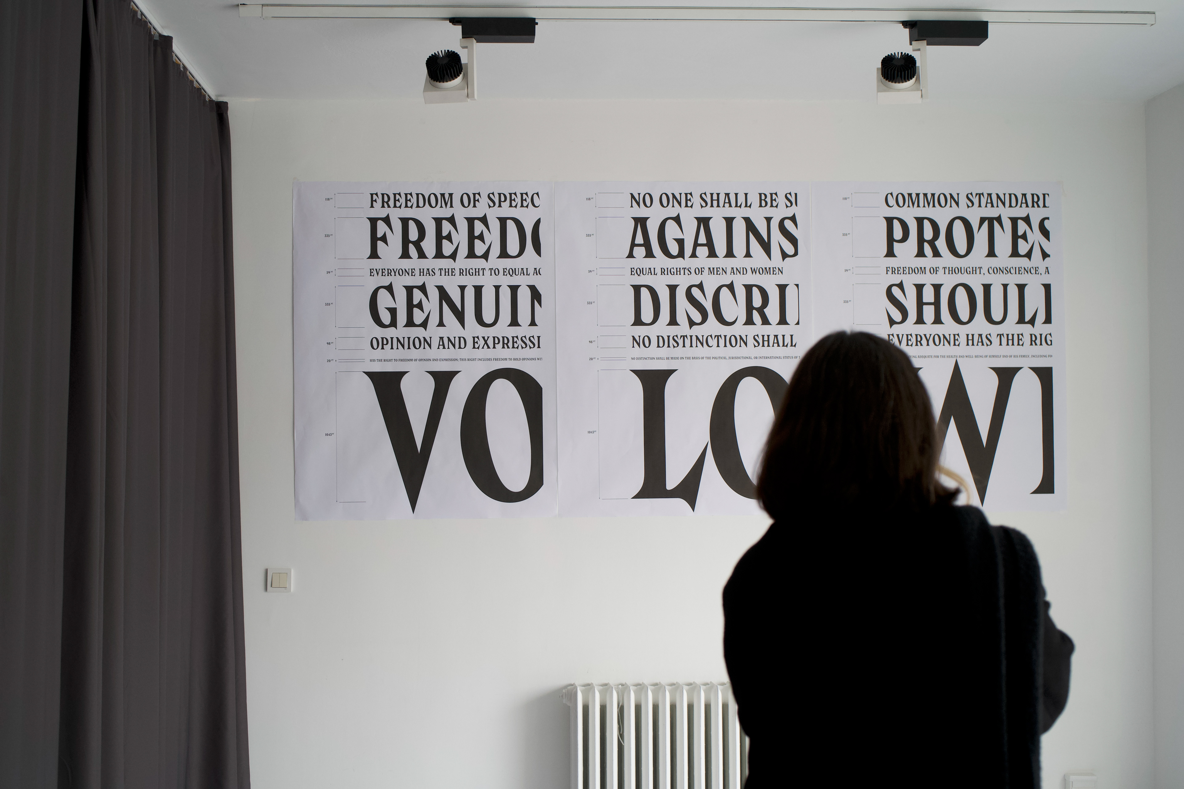
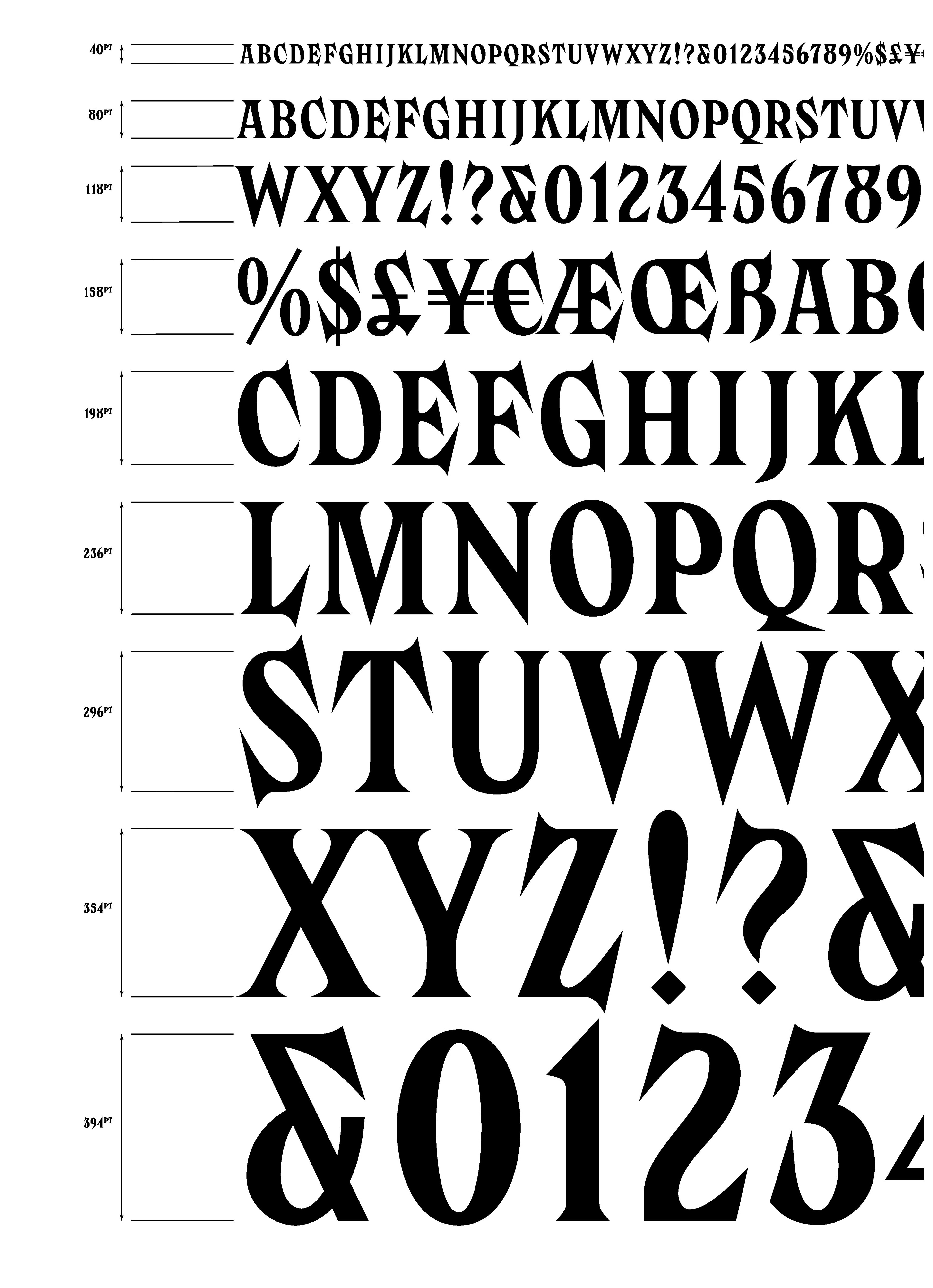
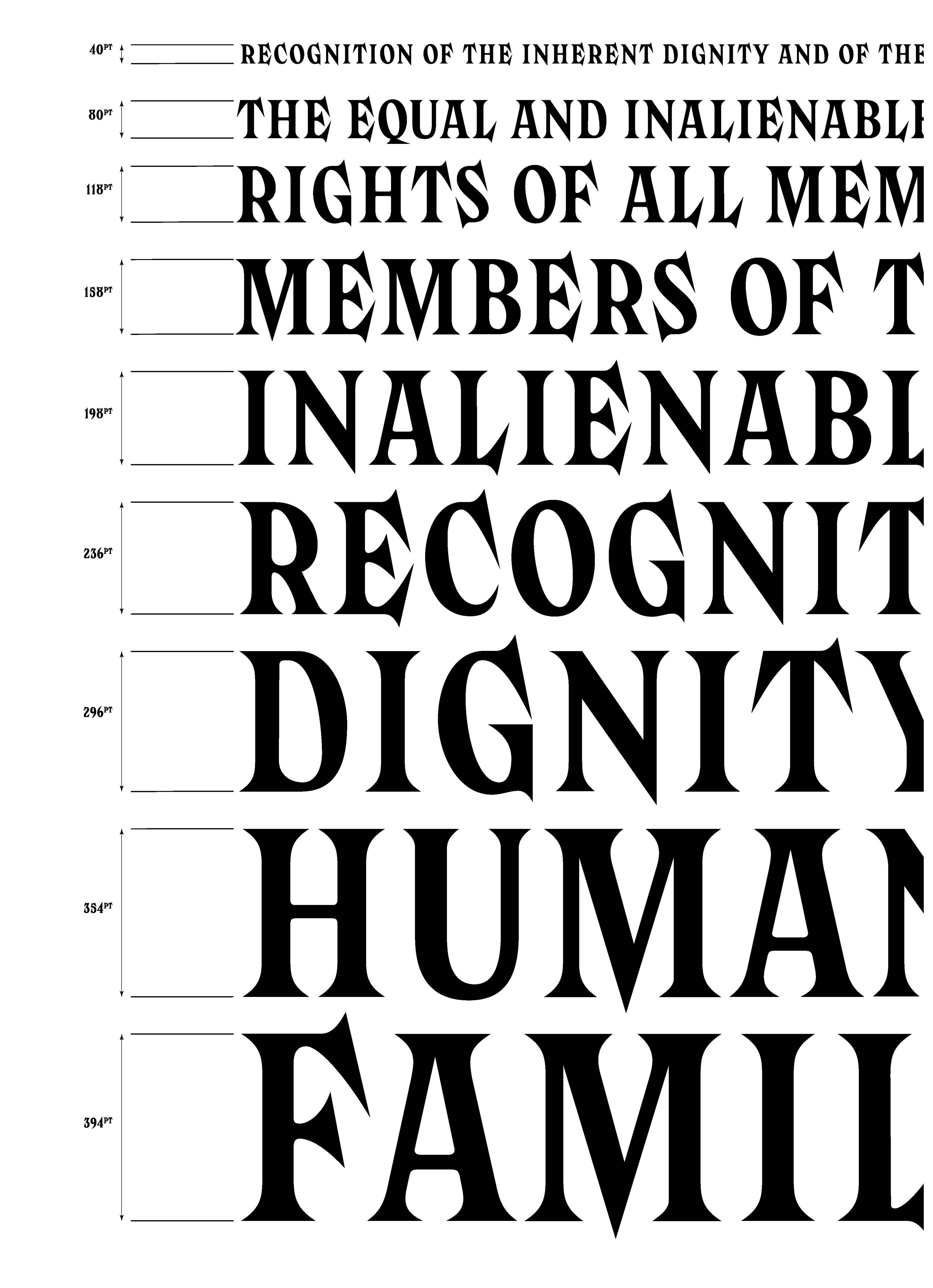
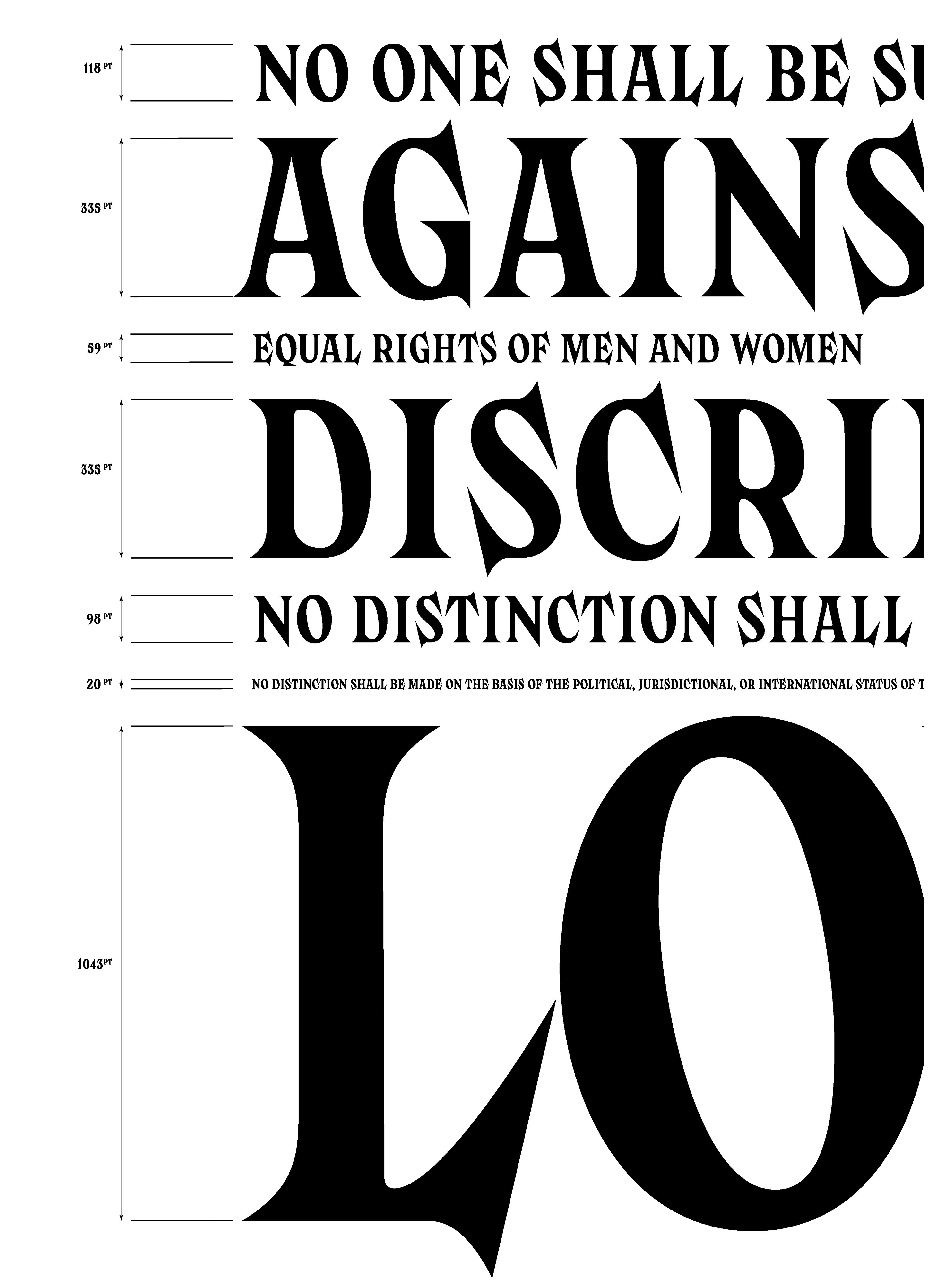
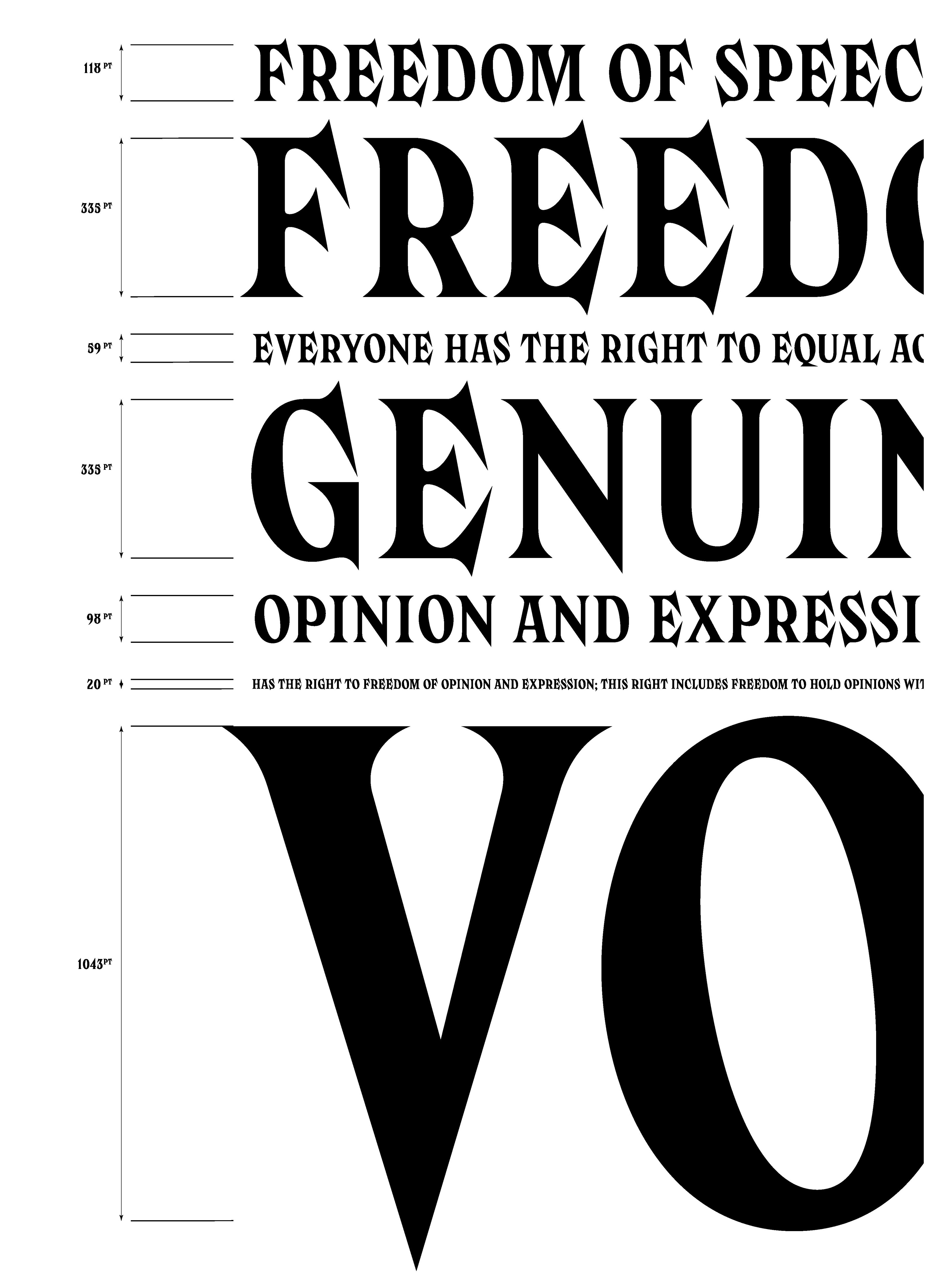
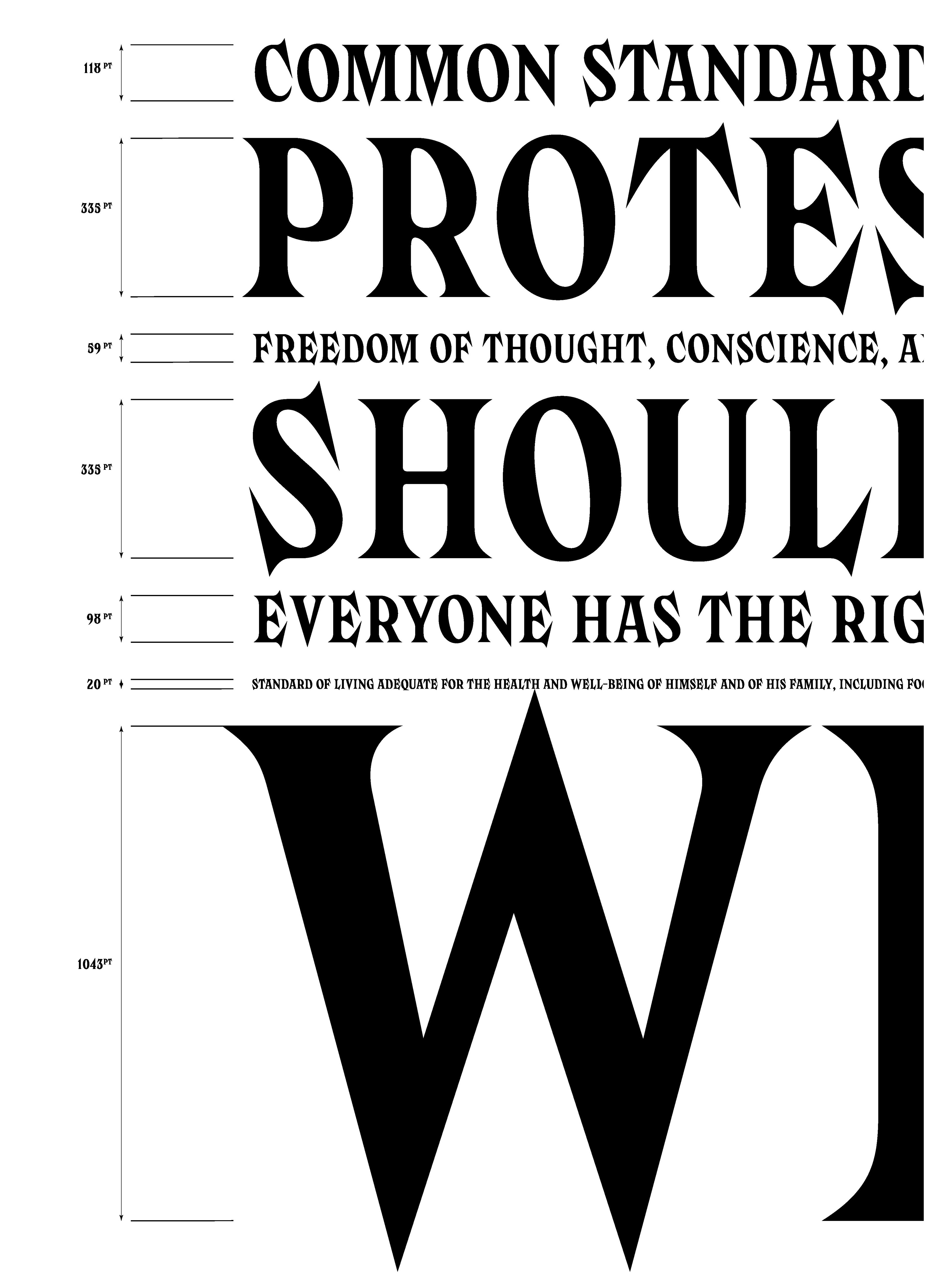
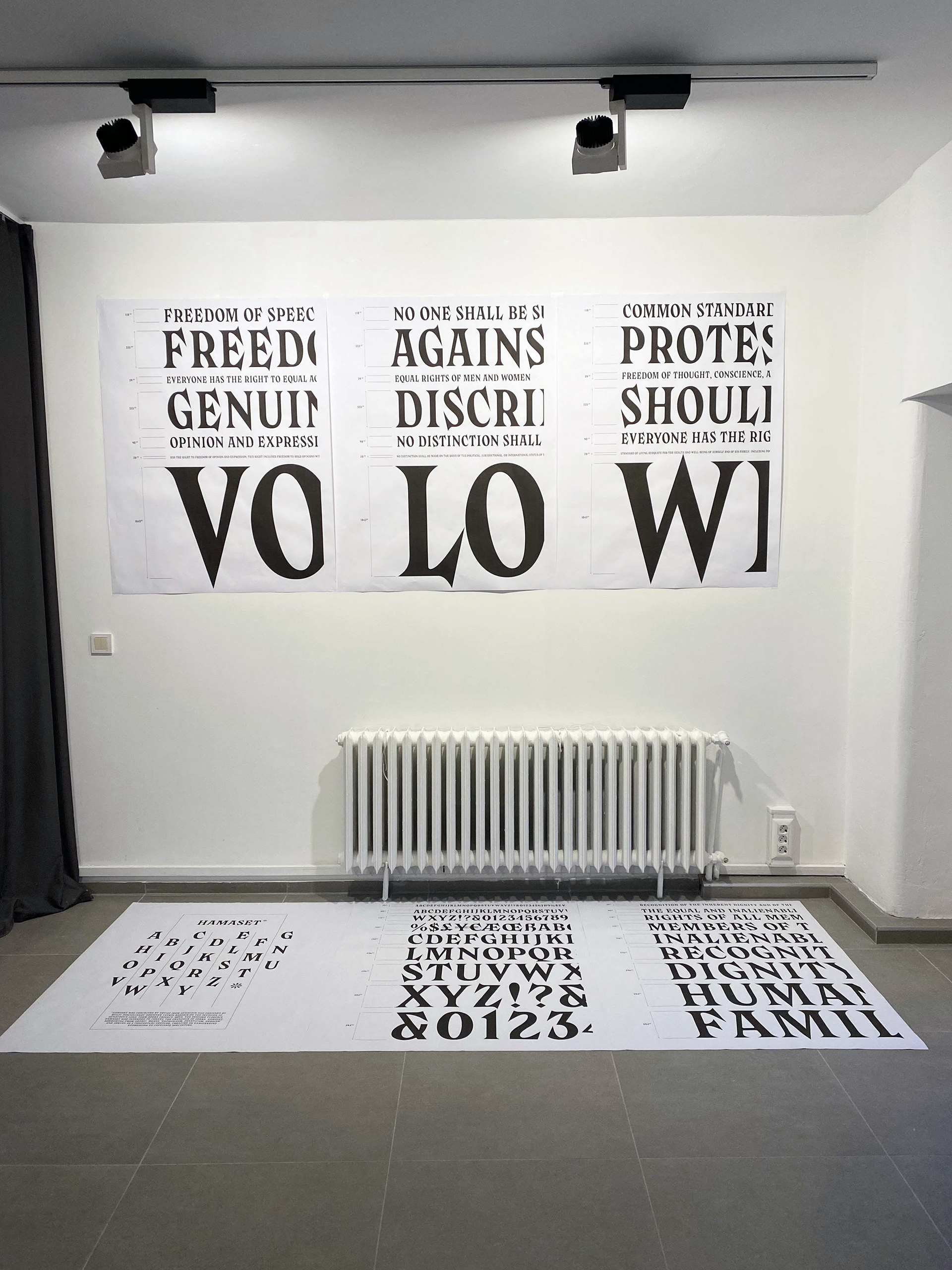
The specimen design of HAMASET turns the Universal Declaration of Human Rights into a fractured typographic landscape, where each word becomes a site of tension between legibility and rupture, idealism and irony. Extracted directly from the Declaration, words like FREEDOM, DISCRIMINATION, PROTEST, DIGNITY, and VOICE are not just typeset, they are sculpted into visual hierarchies that expose the performative fragility of their political promise. Point sizes oscillate violently, from 20pt footnotes to monumental 1043pt declarations, foregrounding the uneven amplification of certain rights over others. Measured with clinical precision, the specimen mimics the rational aesthetics of technical manuals or UN reports, but quickly unravels into something more unruly. The visual weight and swelling of the letterforms begin to resemble monuments or propaganda banners—never neutral, always loaded. By staging these fragments in a typographic register that is both inflated and carved, the HAMASET specimen critiques the aesthetic codes of universalism and state language. It doesn't ask whether these rights exist, it asks who gets to speak them.
HAMASET , developed in collaboration with a designer Yetkin Bașarır on my invitation to visually echo the grandeur of opera while engaging in a critique of contemporary political rhetoric.
Please view the document below, which outlines a version of the specimen design for the HAMASET typeface. This version can vary in its physical realization.
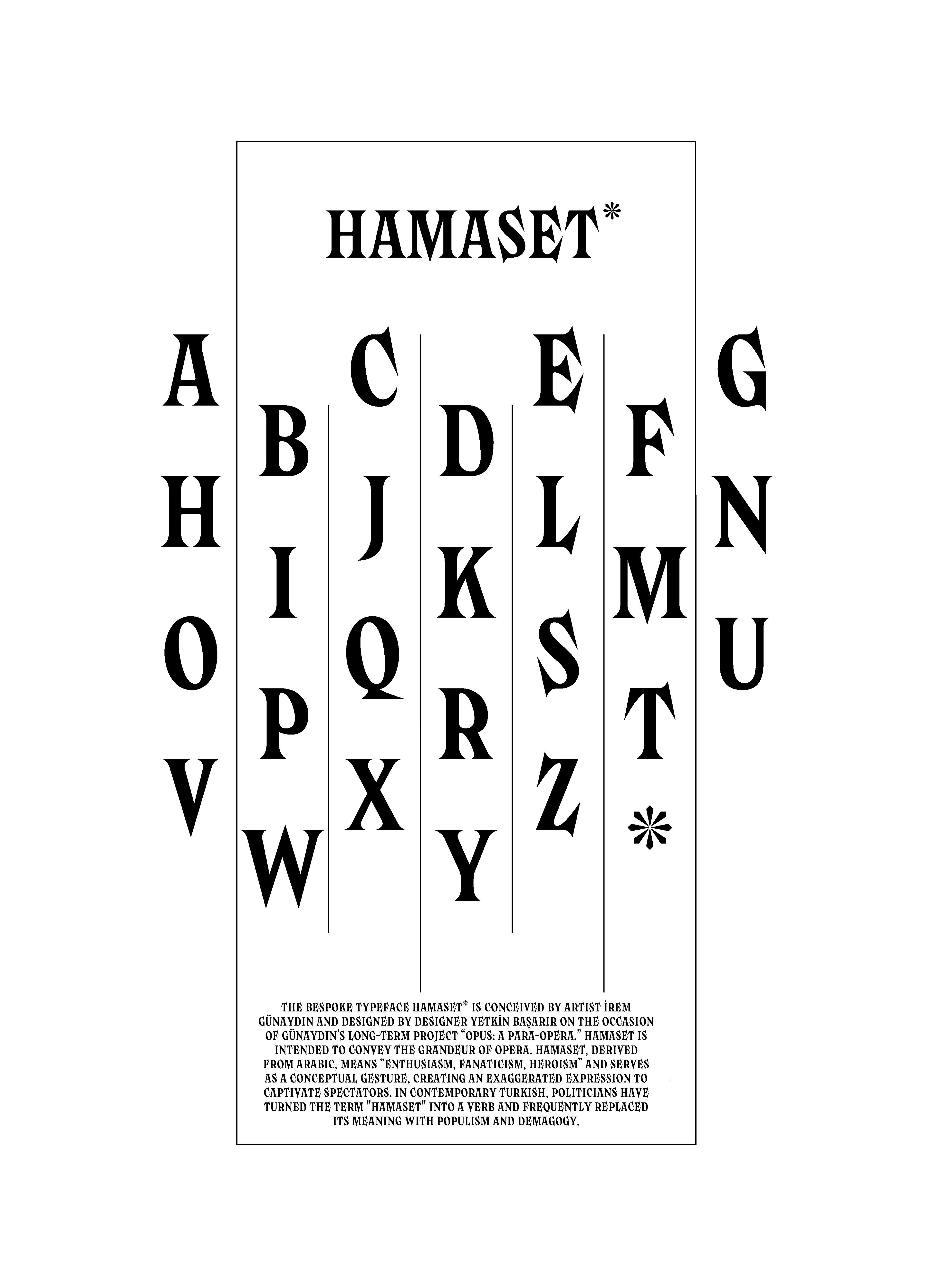
The bespoke typeface Hamaset was conceived for OPUS: A Para-Opera Structure, designed by Yetkin Bașarır
Hamaset is intended to convey the grandeur of opera.
Hamaset serves as a conceptual gesture, creating an exaggerated expression to captivate spectators.
In contemporary Turkish, politicians have turned "Hamaset" into a verb, often replacing its meaning with populism and demagogy.
As OPUS progresses, the font family of “Hamaset” will expand with bespoke versions that conceptually fit each section.

HAMASET Specimen Design Presentation with the designer Yetkin Başarır at Saha Studio, Istanbul.
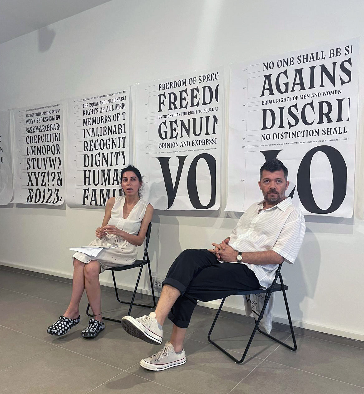
HAMASET Specimen Design Presentation with the designer Yetkin Başarır at Saha Studio, Istanbul.
HAMASET Specimen Design Presentation